Beard Oil for the Creative Underclass
Empower men by providing a product to help groom their beards.
01: Challenge
- Create a fake product and make it real.
- Market a luxury item as a utility to a target that doesn’t know they need it.
- Build a unique brand that stands out among its competitors.
- Apply digital UX concepts to physical product design by focusing on the human experience and interaction with the product.
02: Approach
- Evaluated the competitive landscape to determine where there were holes in the market.
- Determined that none of the established beard oil brands had taken this niche product and turned it into a household one.
- Identified a sizable target market who would benefit from this product.
- Conducted focus groups and surveys with our primary and secondary targets to guide our branding and positioning.
- Concepted for a variety of approaches to the brand.
03: Outcome
- Created a brand and a product from the ground up, including the development of three unique scent profiles using hand-selected essential oils.
- Established a distinguished lifestyle product in the men’s personal care category.
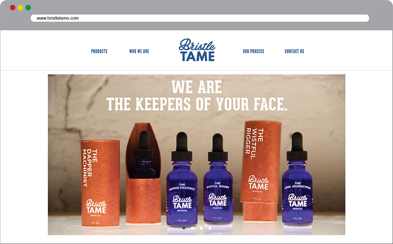
- Brought the product to market by creating an e-commerce website.
Narrative
Brand Essence
Now more than ever, beards have become a major part of a man’s personal identity. For most men, their beards are a symbol of pride and a demonstration of virility.
However, beards that are unkempt are unsightly, no matter how long, full, or majestic they might be. Often they appear dry and prickly and are left to grow unbridled. This is where we identified Bristle Tame’s utility.
What Bristle Tame does is it helps condition beards to be softer and look healthier; it cleanses and nourishes the neglected skin beneath; and it provides a replacement for potent-smelling and chemical-filled colognes.
While concepting for how to market these utilities, we recognized that, in terms of layers, a man’s beard is the first layer by which he is identified when people first meet him. Thus, his beard is incredibly important when making a first impression.
This shaped Bristle Tame’s mission, which is to empower the man by protecting his beard and making it healthy and well-groomed.
Insight
Before all else, a man is identified by his beard when meeting new people.
With the brand’s foundation established, we focused on our target – the Creative Underclass. These are men who abandoned the traditional 9 to 5 cubicle job to join startups and propel the Maker Movement forward.
They are chasing their own dreams of success and their beards give them the confidence to achieve those dreams. Bristle Tame is a luxury item that they are willing to buy because it helps them maintain their beards and fuel that confidence.
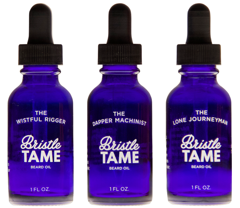
To honor their pursuits, we created three different scent profiles that they could identify with – The Dapper Machinist, The Wistful Rigger, and The Lone Journeyman. These products would be sold in select partner stores, with the majority of sales being made through the Bristle Tame e-commerce website.
For the Creative Underclass, Bristle Tame beard oil is a product that will become a staple in their personal care regimen and their beards will never have looked better.
Design Decisions
Product
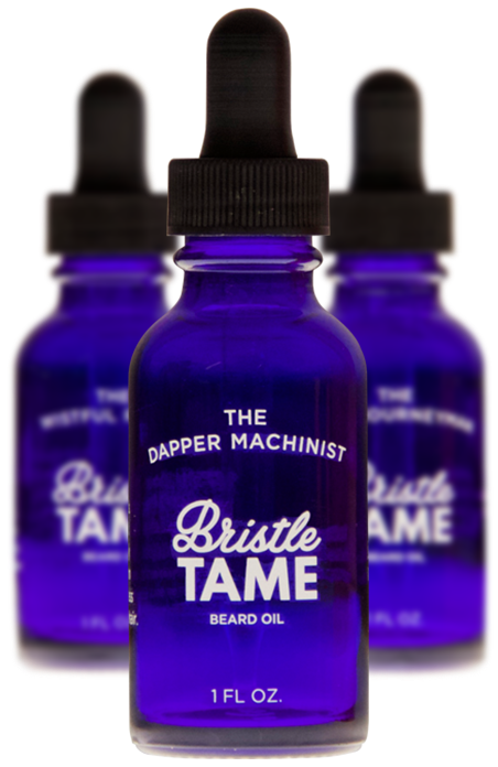
- I chose the blue glass bottles because our competitors use brown ones. This presented an opportunity for Bristle Tame’s bottles and labeling to stand out and become iconic.
- I designed the logo and labeling elements to have a classic and clean aesthetic, which was bolstered by the decision to use direct-to-glass ink transfers for the labeling, rather than paper.
- The white ink labeling on the blue glass provides nice contrast for the eyes and makes the product feel naked, implying a transparent and trust-worthy product.
- I chose to use a squeeze dropper rather than a drip cap because it gives the customer more control over the amount of drops used. Drip caps are inconsistent due to differing viscosity of the oils and can cause the customer to use too many drops at once.
Packaging
-
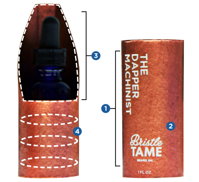
Our competitors’ packaging is boxy, tight, and tends to use a design aesthetic from old apothecaries. To repel the other products on the shelf, I made our packaging cylindrical, clean, modern, and with plenty of negative space.
-
To make our product feel more luxurious, I decided to paint our packaging with copper leafing. Not only would this boost our perceived product value, but it looks beautiful when placed next to our blue bottle.
-
I custom designed the cylinder to be two parts and have a showcase cutaway. This is so that when the customer opens the packaging, the bottle looks as though it is on display, much like a car at an auto show.
-
Lastly I lined the inside of the cylinder with felt so that there would be a snug fit around the bottle during transit. The felt also feels plush when the customer pulls the bottle out of the packaging – a feeling typically associated with jewelry boxes and other high end products.
Website
Process
Squad: VCU Brandcenter
Joel Mazmanian
Copywriter / Videographer
www.joelmazmanian.com
Kory Rozich
Art Director / Experience Designer
My Role
- Helped strategize how to position the brand within the market.
- Helped identify our target audience.
- Researched and analyzed the competitive landscape, conducted focus groups, and helped create surveys.
- Concepted for the brand’s identity and launch campaign.
- Researched how to create beard oil.
- Helped select the essential oils and create our three scent profiles.
- Art directed and designed all of the brand assets, such as the logo, labeling, bottle choice, packaging, photography, and physical prototype.
- Designed and created the e-commerce site.